On Changes in the Market…
What is comfortable and familiar also tends to be easy to maintain. Too many companies can get caught in the trap of remaining static when the changing times demand that the company make changes to keep up. Change, while potentially scary, can be good. We at MicroMD think our latest change is the best kind.
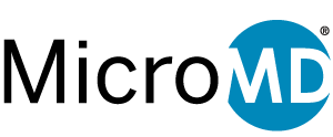
MicroMD’s current logo has been in place since 2006. While it has served us well, we began to notice a change in the aesthetic of our industry. While our logo featured serif and script fonts, many others in our industry were opting for more clean and simple logos, a more modern look, that left our logo, by comparison, feeling antiquated. MicroMD, as a company, is not antiquated and the last thing we wanted was to carry on with a logo that could suggest otherwise. So we began the process of rebranding.

We started with detailed research into our industry and marketing trends to come up with a concept. We wanted to modernize and refresh our logo, which led us to decide on a strong, clean, and simple concept. We knew the typography would change to include something sans serif and we began to consider the possibility of playing around with negative space to create visual interest. One thing we knew for certain that we wanted in our new logo was some sort of shape that would give us flexibility. This shape would be able to stand alone in tiny spaces and could have a future as an application icon. With all of this in mind, our team set out to create a clean, agile, modern, and strong new logo, and we truly believe that we were successful with our final result.
We have already begun rolling out the new logo in a limited capacity and will continue the rollout over the course of the year until the transition is complete. Some of the areas in which you will start to see the new logo already include our MicroMD application login screens, manual covers, public web site, and social media accounts. We feel this new logo represents the company that MicroMD truly is – modern with a strong simplicity. Rest assured that as our logo has been brought into the current times our products are certainly following as we strive to provide the best in physician software experiences. This is the new look of MicroMD and the future looks bright from here.


